Correlations answers one question about two tickers: when one of them moves, what does the other one usually do?
About the Numbers in This Tutorial
Every figure below comes from one reading of SPY against QQQ, taken on 21 July 2026 and carried through the whole tutorial as a single worked example. Open the tool today and your numbers will differ, because the lookback window rolls forward every session. The reasoning is what transfers, not the readings.
Two tickers, one relationship
You pick a Primary Ticker and a ticker to Compare Against. Everything on the page describes the relationship between that pair. Swap either one and every number changes.
The order matters for reading the results, but not for the strength of the relationship. SPY against QQQ and QQQ against SPY agree on how tightly the two move. They differ on the beta rows, which are written as "per 1% of one, how much of the other", and that sentence reads differently depending on which ticker you put first.
Two tickers can sit far apart in price and still move together. What correlation measures is how they move.
It compares moves, not prices
This is the part people get wrong. The tool never compares the two price charts. A $700 ETF and a $12 ETF have nothing to say to each other in dollars.
What it compares is daily percentage moves. For every trading day both tickers were open, it asks what each one did that day, then lines those two answers up. Two stocks can sit at wildly different prices and still move in near-lockstep percentage-wise, which is exactly what the tool is built to find.
Key Idea
Every number on the page comes from a list of paired daily returns. Nothing comes from the price levels themselves. That is why a $700 index ETF and a $12 volatility ETF can be compared at all.
Before anything is measured, the two histories have to be lined up correctly. Three rules do that work.
Only days both tickers traded
The tool keeps a date only when both tickers have a close for it. If one side was shut for a holiday the other observed, or one ticker listed later than the other, those dates are dropped rather than filled in.
This is why the day count in the results is worth reading. SPY against QQQ shares 4,993 days of returns. SPY against a newer product like UVXY shares only 3,688, because the comparison can only start once both existed.
Close-to-close percentage moves
For each surviving date, the tool takes the move from the previous close to that close:
return = (close − previous close) ÷ previous close
Computed the same way for both tickers, on the same dates. The first day in the window has no previous close, so it produces no return.
Simple daily returns, nothing smoothed and nothing compounded. This keeps every day an independent observation, which is what the direction tally and the regression underneath both need.
All the shared history, not a window
There is no lookback setting. The tool uses every day the two tickers have in common, right back to where the shorter history begins. The period covered and the day count are shown with the results so you always know how much ground the numbers stand on.
That is a deliberate trade. A long window gives a stable average and a real sample. It also blends together market regimes that behaved nothing like each other, which is the problem the two charts in Chapter 5 exist to solve.
Common Mistake
Reading a small day count as if it were a full history. A pair whose overlap is short is describing a short life, not a long relationship. Check the day count before you trust the percentage next to it.
Chapter 3
Move Together, Move Opposite
The first block of results is a plain count. Out of every shared day, how often did the two close on the same side?
The headline pair of numbers
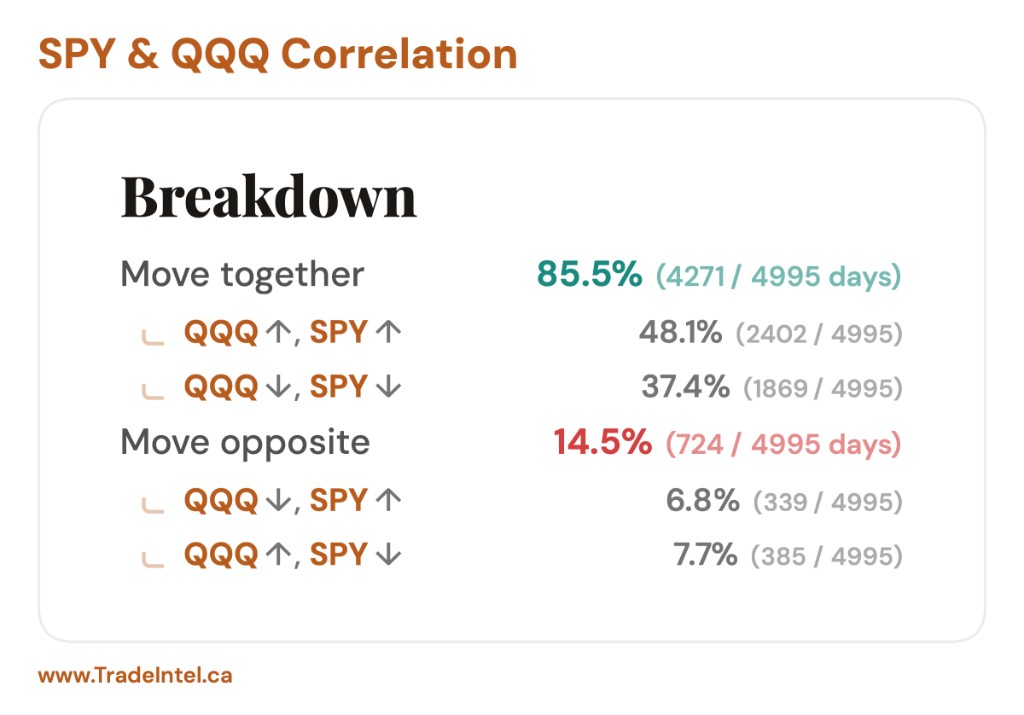
Move together counts the days both finished green plus the days both finished red. Move opposite counts the days one was green while the other was red. The two always sum to 100%, and each shows the raw day count beside the percentage so the sample is never hidden.
A day where either ticker closed exactly flat is dropped from all of it. A flat print carries no direction, so counting it either way would be a guess.
What the numbers actually look like
Three pairs, all measured on their full shared history:
Pair
Shared days
Move together
SPY vs QQQ
4,993
85.5%
SPY vs TLT
4,993
41.6%
SPY vs UVXY
3,688
21.1%
Measured on 21 July 2026. Two large equity indexes agree most days. Stocks against long bonds land near a coin flip. An equity index against a volatility product disagrees four days out of five.
Note where the middle of the scale is. Two unrelated tickers would land near 50%, so 41.6% is not "weakly related", it is slightly tilted toward opposite. Read the distance from 50, not the distance from zero.
The two ways of disagreeing
Underneath the headline, the opposite days are split in two: the days the compared ticker fell while the primary rose, and the days it rose while the primary fell. These rarely come out even.
On SPY against QQQ, 6.7% of days were QQQ down with SPY up, and 7.7% were QQQ up with SPY down. A gap like that says the disagreements have a lean to them, which a single "14.5% opposite" would have hidden.
Reading Tip
Same-direction rate is a count of days, not a measure of size. Two tickers can finish green together on 85% of days while one of them moves three times as far each time. Chapter 4 is where size comes in.
Direction tells you whether they agree. Beta tells you by how much.
The question beta answers
Beta is the average move in one ticker for every 1% move in the other. The tool reports it in both directions, as two separate rows, because they are two different questions with two different answers.
beta = correlation × (volatility of A ÷ volatility of B)
Reversing the pair flips the volatility ratio, which is why the two rows rarely match.
Why the two rows are not reciprocals
This trips people up constantly. On SPY against QQQ the tool reports:
Per 1% QQQ move, SPY moves +0.81%
Per 1% SPY move, QQQ moves +1.05%
If these were reciprocals, the second would be 1 ÷ 0.81 = 1.23. It is 1.05. The gap is not an error. Each row is a separate regression, and each one is dragged toward zero by the part of the move the other ticker does not explain.
Multiply the two rows together and that missing piece becomes visible: 0.81 × 1.05 = 0.85. That product is the share of each ticker's daily movement the other one accounts for. About 85% of what SPY and QQQ do on a given day is common to both; the remaining 15% is their own.
When the two rows look nothing alike
SPY against UVXY is the extreme case:
Per 1% UVXY move, SPY moves −0.11%
Per 1% SPY move, UVXY moves −5.36%
Both negative, so they lean opposite, which the 21.1% same-direction rate already said. The size gap is about volatility: UVXY swings many times harder than SPY, so a 1% wobble in it barely registers in SPY, while a 1% move in SPY corresponds to a violent move in UVXY.
The same multiplication still applies: 0.11 × 5.36 = 0.59. Roughly 59% of the daily movement is shared, and it is shared in opposite directions. A strong relationship, even though one of the two beta rows is nearly zero.
Common Mistake
Treating a near-zero beta as no relationship. A beta near zero can mean the other ticker is simply far more volatile, not that the two are unrelated. Read both rows and the same-direction rate before deciding.
Everything above this point is one number covering many years. The two charts exist because that single number can describe a relationship that never actually existed.
Year by year
The first chart splits the same tally into calendar years, two columns each: the share of that year's days the pair moved together, and the share it moved opposite. It answers whether the headline is a steady fact or an average of years that disagreed.
Rolling correlation
The second chart tracks the correlation over a trailing 30-day window, redrawn every day. Above the zero line the pair is moving together, below it they are moving opposite, and the caption calls out the highest and lowest readings with the dates they happened.
The case that makes the point
SPY against TLT moves together on 41.6% of days, which reads as a mild lean toward opposite and nothing more. The rolling chart tells a different account entirely:
Pair
Rolling low
Rolling high
SPY vs TLT
−0.89 (Nov 2011)
+0.79 (May 2026)
SPY vs QQQ
+0.49 (Dec 2020)
+0.99 (May 2025)
SPY vs UVXY
−0.97 (Aug 2019)
−0.16 (Jul 2023)
Measured on 21 July 2026. SPY against TLT has been strongly negative and strongly positive at different times. The mild average describes neither period.
Stocks and long bonds ran hard in opposite directions in 2011 and hard in the same direction in 2026. The full-history average sits between two regimes that behaved nothing alike, and a hedge built on that average would have been wrong in both.
Compare that with SPY against QQQ, which never left the +0.49 to +0.99 range. Same kind of headline number, completely different reliability underneath it.
A correlation is only worth as much as its stability. The headline gives you the average; the rolling chart tells you whether the average ever happened.
Both charts are easier to read on the real thing. Open the tool with its guided walkthrough running and it steps through the pair inputs, the VIX filter, the results breakdown and both charts on live data.
The one optional control on the page. It restricts every number to days that began in a chosen volatility environment.
How it selects days
Each return day is bucketed by where the VIX opened that morning: under 20, between 20 and 30, or above 30. The bucket is the environment the market was in when the move was generated, and only days matching your choice survive into the count.
The filter runs after the daily moves are computed, never before. That keeps every return a true close-to-close move and simply drops the ones that do not belong to the regime you asked for.
Your choice is written into the URL, so a filtered view can be shared or bookmarked exactly as it looks. Switching back to No Filter clears it again.
What it exposes
SPY against QQQ, the same pair unfiltered and then in each of the three regimes:
Setting
Days
Move together
1% QQQ → SPY
1% SPY → QQQ
No filter
4,993
85.5%
+0.81%
+1.05%
VIX under 20
3,190
85.0%
+0.69%
+1.18%
VIX 20 to 30
1,347
85.9%
+0.75%
+1.12%
VIX above 30
456
87.7%
+0.96%
+0.94%
Measured on 21 July 2026. The same-direction rate barely moves. The betas do.
Read the two beta columns down the table. In calm markets the indexes are clearly different animals: QQQ moves about 1.18% for every 1% in SPY. Through the middle bucket that gap narrows to 1.12, and above VIX 30 it closes almost completely, to 0.96 against 0.94. The convergence is steady rather than a jump, and by the time the market is truly stressed the two have stopped behaving like separate exposures.
This is the practical version of the old line about correlations going to one in a crisis. Diversification between two large equity indexes is worth least at the exact moment you were counting on it.
Watch the Sample
Filtering costs days. The VIX-above-30 view rests on 456 days against 4,993 unfiltered, because truly stressed markets are rare. The day count is shown for exactly this reason: a filtered reading is a smaller sample with more room for chance variation, and the tighter the filter the more that matters.
Each row above is a link. Open the same pair with the filter already set and compare the numbers yourself: